• Steel Soldiers now has a few new forums, read more about it at: New Munitions Forums!

  • Microsoft MSN, Live, Hotmail, Outlook email users may not be receiving emails. We are working to resolve this issue. Please add support@steelsoldiers.com to your trusted contacts.

3D Printed Tachometer Gauge Pod, with 12V / USB Outlets

Awesomeness

Well-known member
Steel Soldiers Supporter
1,813
1,519
113
Location
Orlando, FL
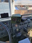
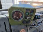
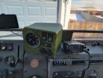
I've been working on a new tach pod, that can also hold the winch switches. This will probably (eventually) get more revisions, because it's big, ugly, hangs over the front of the heater a little, etc., and I don't like it. There were a couple iterations to get to this one, and the reason for the large size and ugly shape is that the winch panel wiring harness is big, with a lot of unused connectors that all need to be stuffed inside this housing. I tried to keep it to where it's blocking a minimum of the driver's vision (you can see on the right side, it basically only covers up the area of the defroster deflector that was already opaque).
PTW-43-4-PT-0664 (Main Base) - 3.jpg
PTW-43-4-PT-0664 (Main Base) - 2.jpg
PTW-43-4-PT-0664 (Main Base) - 1.jpg
PTW-43-4-PT-0664 (Main Base) - 5.jpg
 
Last edited:

Bulldogger

Well-known member
Steel Soldiers Supporter
1,330
586
113
Location
Quantico VA
I've been working on a new tach pod, that can also hold the winch switches. This will probably (eventually) get more revisions, because it's big, ugly, hangs over the front of the heater a little, etc., and I don't like it. There were a couple iterations to get to this one, and the reason for the large size and ugly shape is that the winch panel wiring harness is big, with a lot of unused connectors that all need to be stuffed inside this housing. I tried to keep it to where it's blocking a minimum of the driver's vision (you can see on the right side, it basically only covers up the area of the defroster deflector that was already opaque).


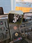
View attachment 826956
I thought that box was oversized, but the last picture explains it. Great googally moogally, that's a lot of wiring.
 

Awesomeness

Well-known member
Steel Soldiers Supporter
1,813
1,519
113
Location
Orlando, FL
I thought that box was oversized, but the last picture explains it. Great googally moogally, that's a lot of wiring.
Yeah, and the wire bundle is really stiff. Trying to get it to connect to the switches, and then bunch it up inside the box is challenging. I had a few iterations before this, based off the original "cool looking" tach pod, each getting bigger and bigger, and they still didn't fit. I made this one a lot bigger, and there may be a little bit I can trim out, but it's pretty good.

I didn't want to cut the harness.

you planning to put your radio to the left on the pod in next iteration? would make since if so.. on side? top? bottom? any of those would work.. on top or bottom IMHO best so you do not have to read sideways numbers on its screen.
I'm not sure. That radio mount was quick and dirty. I'm not sure if I plan to keep this radio long term, or buy a better one. It was an interim solution until I could research the best solution.
 

Third From Texas

Well-known member
2,766
6,498
113
Location
Corpus Christi Texas
Sweet stuff !

Personally, I'd kick the gauge face towards the driver and let the switches ride at 90° (just trying to fit the theme of the rest of the cockpit and the heater controls). Basically, keep the tech face at driver angle fit nicely over the airbrake controls. The rest squared up with the heater lines and the existing radio you have. Then I'd angle the rear downward a bit for looks.

I'm OCD about stuff like that to the degree of being anal. I'd like to go in a redo the entire cockpit because there are a number of things I would have designed differently. But money and time are running out. LOL

And if you are going into production with them, I'd incorporate some screw points that multiped modules can be linked for mounting (radio, stereo, tablet display, GPS, etc). $$$$$$$$$

;)

Don't mean to sound critical, your tach looks Awesome(ness). I've just been thinking of how I will mount mine someday.

*excuse my l33t CAD skillz with MS Paint
 

Attachments

Awesomeness

Well-known member
Steel Soldiers Supporter
1,813
1,519
113
Location
Orlando, FL
Sweet stuff !

Personally, I'd kick the gauge face towards the driver and let the switches ride at 90° (just trying to fit the theme of the rest of the cockpit and the heater controls). Basically, keep the tech face at driver angle fit nicely over the airbrake controls. The rest squared up with the heater lines and the existing radio you have. Then I'd angle the rear downward a bit for looks.

I'm OCD about stuff like that to the degree of being anal. I'd like to go in a redo the entire cockpit because there are a number of things I would have designed differently. But money and time are running out. LOL

And if you are going into production with them, I'd incorporate some screw points that multiped modules can be linked for mounting (radio, stereo, tablet display, GPS, etc). $$$$$$$$$

;)

Don't mean to sound critical, your tach looks Awesome(ness). I've just been thinking of how I will mount mine someday.

*excuse my l33t CAD skillz with MS Paint
Just so you know what I was thinking, every bit of how it is currently is intentional. Those aren't things I overlooked.

  1. If the face plate isn't flat across the front, there is no way to 3D print it (in FDM 3D printing) to get a nice smooth print. One side of the teeter-totter would be flat against the bed, and the other side would be popped up and thus have to be printed with supports underneath. The supports don't always come off really cleanly, and even if they do it would be a noticeable difference in surface texture/quality. I've considered doing some tests on a two-piece face plate that would connect together, or even one with a living hinge that would fold up and screw in place. There is only so much time in a day.
  2. The factory heater guard is in the way. The way it currently is, the 12V plugs can just get in from the side, but when turned flat you have to start reaching through the guard, which I didn't like when I mocked it up.
  3. The tach is currently faced directly toward the driver. So when you're sitting in the driver's seat, it's angled so that you are looking straight at it. Other positions I tried annoyed me. Straight back wasn't bad, but I liked it facing me better, because I would get a nasty glare often.
  4. I didn't want to stack more things on top/side because my goal was to maximize visibility. I don't even like that this current version blocks more of the windshield, and will probably eventually try to cut it down just a little more. The radio was also put intentionally in the middle of the truck so that it didn't block the windshield and can be reached by both the driver and passenger(s). Incorporating screw points isn't a big deal though, and could be done "just in case".
I'm OCD about this stuff too (and do it for a living). There is probably already 100+ hours of work to get to this point. The constraints just aren't ideal.
 
Last edited:

Third From Texas

Well-known member
2,766
6,498
113
Location
Corpus Christi Texas
Rgr all.

It also dawned on me that clearance issue also arise when a Red Dot AC is added into the mix (even more so when it's a gen 3 due to extra height). And then there are the protection guards that extend the issues...

I'm like you are far as trying to avoid obstructions to visibility (it's one reason that if I were 20 years younger with a serious project budget, I would gut the interior and build it all custom from scratch).

:)

2-kiravan-cabin-interior-1040x600.png
 

Awesomeness

Well-known member
Steel Soldiers Supporter
1,813
1,519
113
Location
Orlando, FL
Automobiles are some of the most highly engineered products on the planet. It spoils us, and sets a high standard for what we want. There is like a million man-hours of engineering that goes into a single vehicle design before it rolls off the production line with a slick custom injection molded dashboard. That's a hard act to follow.

So the LMTV got a flat steel plate with some gauges in it, and a few rivet nuts on top of the dash for accessories, haha. (Even that probably took 1000 hours of design work and meetings, if we're being serious.)
 
Top
AdBlock Detected

We get it, advertisements are annoying!

Sure, ad-blocking software does a great job at blocking ads, but it also blocks useful features of our website like our supporting vendors. Their ads help keep Steel Soldiers going. Please consider disabling your ad blockers for the site. Thanks!

I've Disabled AdBlock
No Thanks