• Steel Soldiers now has a few new forums, read more about it at: New Munitions Forums!

  • Microsoft MSN, Live, Hotmail, Outlook email users may not be receiving emails. We are working to resolve this issue. Please add support@steelsoldiers.com to your trusted contacts.

Steel Soldiers 20th Anniversary Logo Contest!!!

99nouns

Member
816
17
18
Location
Ocala, FL
I like this one's simplicity.


This oval design would make a great brass belt buckle! I can also see it readily adaptable to patches, pockets, money clips, and imprintable on many novelty items as well.

BUT, here's the Chaplain's big HOWEVER.....

The "spade" could still be offensive to some. It is, to the best of my understanding, irrelevant to the SteelSoldiers membership in general.
This WIKI https://en.wikipedia.org/wiki/Ace_of_spades tells some of the Spade's history in war (favorable); the "IDIOMS" section of the WIKI states a very valid case for NOT incorporating it into this website's logo. Additionally, many Christians and Christian denominational doctrine hold to the explanations well described in this link... http://www.eaec.org/bibleanswers/playing_cards.htm , so in the interest of those deeply held beliefs, even with regard to any use of the emblem to rally troops, I must still assert that this emblem has no real justification for inclusion in a logo that is intended to represent unity of MV enthusiasts of such a broad spectrum of beliefs.
Wow I never knew, that is serious, I am going to reconsider my membership here specially a website represented with a sign of anti peace in it's logo from the book of devil.

I kind of thought sacrificing your life for others were sacred, but unfortunately people take purity and make it completely demonic.

This is also why I dont want to put flag of U.S. on a shirt made to be sold to public, because there are many people out there who thinks the Constitution American flag represents is only for select race and religion of people, which that violates the very same values of the U.S. Constitution.

If you are proud of American flag then carry it in your words and actions.

It is like a Church holding a poker night on Saturdays.
 
Last edited:

73m819

Rock = older than dirt , GA. MAFIA , Dirty
Steel Soldiers Supporter
In Memorial
12,195
325
0
Location
gainesville, ga.
It is all about pc correctness and NOT offending someone, there are people who will be offended by a blank piece of paper, so SCREW the pc correctness, the 20 years of SS is only important to us SSers and NOBODY else so let others get offended, who cares, remember being offended is the new hobby for some. If these offended morons want to think that we are WW2 ss supporters, it is plain to see they NEVER visited this great SITE.
I need to stop before the KGR leaves the building.
 

Tinwoodsman

Well-known member
Steel Soldiers Supporter
3,923
76
48
Location
Comfort, Texas
There are probably few groups that stand for high values more than Steel Soldiers. You cannot let a certain sentiment dictate what you like and believe in. If that becomes our standard then I certainly do not need a shirt that bad.
 

maa45069

Active member
Steel Soldiers Supporter
454
68
28
Location
cincinnati/OH
My little opinion that really doesnt matter.. This is turning into a dramatic shift in subject. We all need to calm down and stop crying. I can tell you I am a proud American and I dont need a flag to "wear my patriotism" on my sleeve, Just live it. SS , as I know, is not really a preppers site, radical group, or political. We are a bunch of people who love military surplus vehicles, machines, generators, trailers, trains, and every other ex military supply. I usually see our site in a positive manner whether at a parade, museum or during catastrophes helping people. So I think we should eliminate any chance at seeming Otherwise. I have brothers here that are by far some of the most helpful people i've ever met and we should be "advertising" how great we are. If you should feel compelled to have an American flag more power to you. I do have a potential solution.We can just make velcro spot on the shoulder and sell 5 ton truck patches deuce patches humvee patches... kind of like a rank. But then you can also slap a flag on it. Either way I'll buy a shirt.

Sent from my SM-G935T using Tapatalk
 
Last edited:

99nouns

Member
816
17
18
Location
Ocala, FL
That looks very good. :)

For the number 20, please still something green instead of black and it is even more beautiful.
This is of course my personal taste. :)

Please do not fight over the flag.
I would take a shirt or cap with or without a flag.
Number 20 is on a dark and light green bridge plate, it is not on black. Tilt your monitor a little and you can see it.
 

USAFSS-ColdWarrior

Chaplain
Super Moderator
Steel Soldiers Supporter
18,541
5,848
113
Location
San Angelo, Tom Green County, Texas USA
Ok.
I knew that my comments about the incorporation of a spade on the 25th Anniversary Logo would surely ruffle some feathers all the way to the top of levels of Command.

I am fully aware that this emblem has been a part of the website banner for a long, long time as well.

The call has gone out for creative suggestions for a "new" logo to adopted with and celebrating the SteelSoldiers website's Silver Anniversary.

As with many long-established institutions, such a milestone is a time to deeply reconsider all aspects of what they and their publicity tools represent. There are many logos that morph or completely change with changing times, markets, perceptions and most importantly UNDERSTANDING. Maybe the time has come with the marking of this anniversary to reconsider every detail of this project.

In example: How many "beauty marks" (aka: moles) on a person's skin been seen as attractive, eye-catching, and even sexy? Do you realize that in time what may have been long viewed as a thing of beauty one day is recognized as a cancerous growth that could have and should have received the proper attention sooner - often by removal due to its inherent unhealthiness? It's true.

In another example: Can you think of a long popular celebrity, political leader, or spokesperson who was held as a pillar of our society, only to be toppled by revelations of corrupt, sinister, criminal, or perverse behaviors that ultimately caught up to him/her? Indeed, the list of these individuals is lengthy. History reveals the true character, the long-arm of the law has great reach. And icons fall.

Once the truth is revealed, to discount or disregard its value is to assert ignorance (ignore-ance - this DOES NOT equate to stupidity - it is instead the active choice to "ignore" truth when enlightened).
(NOTE: Nothing in these comments are intended to belittle anyone. I share these insights in the most loving manner possible.)

With regard to PC - Political Correctness - I have found that in every case where this term is asserted, what is "PC" is inherently Biblically wrong. Offending another man is an invalid moral scale. However, the One Judge we should strive to never offend is God. Let us evaluate everything we think, do or say from His standard and not that of mankind.

Yes, it's Chris' website. And yes, he is well known to me to be a man of integrity, insight, self-control and fortitude. Whether or not that device remains a part of the website's signage is a decision that only his final approving or disapproving authority can assert.

I have stated, and stand by my views.
As for me and my house, we will serve the Lord.

Respectfully in prayer,
John
SS Chaplain
 

99nouns

Member
816
17
18
Location
Ocala, FL
Ok.
I knew that my comments about the incorporation of a spade on the 25th Anniversary Logo would surely ruffle some feathers all the way to the top of levels of Command.

I am fully aware that this emblem has been a part of the website banner for a long, long time as well.

The call has gone out for creative suggestions for a "new" logo to adopted with and celebrating the SteelSoldiers website's Silver Anniversary.

As with many long-established institutions, such a milestone is a time to deeply reconsider all aspects of what they and their publicity tools represent. There are many logos that morph or completely change with changing times, markets, perceptions and most importantly UNDERSTANDING. Maybe the time has come with the marking of this anniversary to reconsider every detail of this project.

In example: How many "beauty marks" (aka: moles) on a person's skin been seen as attractive, eye-catching, and even sexy? Do you realize that in time what may have been long viewed as a thing of beauty one day is recognized as a cancerous growth that could have and should have received the proper attention sooner - often by removal due to its inherent unhealthiness? It's true.

In another example: Can you think of a long popular celebrity, political leader, or spokesperson who was held as a pillar of our society, only to be toppled by revelations of corrupt, sinister, criminal, or perverse behaviors that ultimately caught up to him/her? Indeed, the list of these individuals is lengthy. History reveals the true character, the long-arm of the law has great reach. And icons fall.

Once the truth is revealed, to discount or disregard its value is to assert ignorance (ignore-ance - this DOES NOT equate to stupidity - it is instead the active choice to "ignore" truth when enlightened).
(NOTE: Nothing in these comments are intended to belittle anyone. I share these insights in the most loving manner possible.)

With regard to PC - Political Correctness - I have found that in every case where this term is asserted, what is "PC" is inherently Biblically wrong. Offending another man is an invalid moral scale. However, the One Judge we should strive to never offend is God. Let us evaluate everything we think, do or say from His standard and not that of mankind.

Yes, it's Chris' website. And yes, he is well known to me to be a man of integrity, insight, self-control and fortitude. Whether or not that device remains a part of the website's signage is a decision that only his final approving or disapproving authority can assert.

I have stated, and stand by my views.
As for me and my house, we will serve the Lord.

Respectfully in prayer,
John
SS Chaplain
If there is any slightest reconsideration, I am willing to offer my skills free of charge for the sake of God and the goodness.
 

steelsoldiers

Administrator
Staff member
Administrator
5,264
4,007
113
Location
Charleston, WV
I certainly appreciate everyone’s input on the spade symbol, but please don’t read too much into it. The Ace of Spades has long been associated with our military kicking butt in battle. A few examples of this are the Ace of Spades gun-truck in Vietnam, the tradition of members of the 101st Airborne painting a spade on the side of their helmets during WW2, and scaring the crap out of the Vietcong by leaving Ace of Spades cards on their dead. It got added to the Steel Soldiers logo at some point because it looked badass. That’s all. It doesn’t have to be part of the new logo.

Now back to the logo contest. Keep up the great work, everyone!
 

SouthJL

Member
Steel Soldiers Supporter
53
2
8
Location
Piedmont Triad, NC
No offense was intended, my rationale for incorporating the spade was simply taking the existing design elements from the website. I tend to agree with Chris, don't read into the spade too much. Many symbols have different meanings among different people, cultures, religions etc...

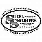
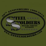
With that being said... the spade is easily removed. Removing the spade left some empty space, so the oval got flattened a little bit and I've experimented with a second line of stars. I'm open to any criticism or suggestions, but please hopefully just keep it constructive and about the logo. :)

ss-logo-oval-white2.jpgss-logo-oval-olivedrab2.jpg

Only thing I noticed this time (even though it was in my original oval) was the ever-so-subtle color in the oval band. In my opinion, it looks good on the OD background, but on pure white background I think I need to change the inner oval band to solid white.


As far as when its time to vote, I personally think Chris should pick his top-X favorites, ignoring subtle variations, then let the SS community vote on those. I'm not a professional graphic designer, just someone that has been around computers for a while. No matter what logo or logos are picked, there's probably going to need to be some modifications for the specific application. What works on a t-shirt, might not be a good sticker. What works for any of the swag may not work for a website banner.

I'm hoping there are a few others that submit other designs as well.
/John
 

99nouns

Member
816
17
18
Location
Ocala, FL
Here I will be posting all of my submissions in next post so you don't have to hunt them down, also I will try to post them in Higher Definition than before as links so they can be just copied and used in polling thread which I dont know if it will be a new thread or just added here.

I have few thoughts about this whole process, it might be wise to to do few polls in elimination style, so first we would pick the design everyone likes the most ignoring all the colors, then go back and use different color and small style tweaks with suggestions thread then make like up to 10 different variations of the same design and re-poll it to see which one is the best liked, but I guess steelsoldiers is the one who will choose the path how this will be done and how much time he wants to invest into this.

I personally recommend not having more than 3 colors on the shirt if you want a quality shirt that will last a long time for screen printing, if we get the shirts in color printed you better frame it and hang it in a dark room with air tight seal, it fades, and if you pick more than 3 colors and screen print, then expect to pay some premium price for it because each color goes on different frame and time, so first color has to dry before the second color. This info based on my experience 6 years ago, I might be wrong or there might be new technology,

So we need steelsoldiers to let us know what he wants to do and what is his printer company is capable of doing before this whole voting for a design is complete, we dont want to pick a full color design and find out it cannot be printed on a shirt later then we have to go back and pick another one.

You might pick couple of design from here and show to printer company so he can make his suggestions, also I heard some colors cannot be printed.

So what I lately did is, I lightened the color of the shirts a little, because real OD green on my computer screen looks good but on my phone looks like almost black, so just to add some highlight to design I lightened up the OD green a some, but please ignore that and just look at the SHAPE of the design that is most eye pleasing. Color of the shirt has nothing to do with what you see on the pictures, actually the printing company has to find the shirt that's correct color, and good luck with finding "dark OD green" everyone is asking for, it probably will looks like silver with mold growing on it. (I would like to be surprised)

So you will see different color variations of my designs so again please ignore the colors and pick the "most eye pleasing SHAPE" then it can also be edited again for better color, size or even add to the design.
 

99nouns

Member
816
17
18
Location
Ocala, FL
Simple Design
This is where all started, these are the ones I first made which evolved to SD02, SD03 and SD04.

SD01
69593e3c19c577c40ddc75284ae6e532.jpg93c3d63d6ea7046505feb87e8d42de8a.jpg


SD02 also gets a new badge.
975f62d4aa88ed5c6915feefae51c753.jpg093d7dc602d122850b0aed9c8e32a35e.jpg729e71c2c3f6ea2b49033d0672bcf820.jpg7fec0f4a9e4787a9b668170823128eae.jpgf73095ccc57066861248b8f4c187296d.jpg57fc5aab416680133df288521e057de3.jpg


SD03 Badge gets updated again.
c69f1330b674206176a2e4e9a6f3d491.jpg3f4c438a18ed25516fdbbcd9ee94768c.jpg


SD04 Attempting 3D
109159ffd9dedd8d596773f2aec7ccf9.jpg061c43dd543415303a04053eef313bcb.jpg


Tire Mark Design
Dedicated to Wes.
24d26fae8504fe02857d51f9c6b0f898.jpg


Trucks Design
This is where I wanted to be visually more described but unfortunately it only broke the thread down because of the guys who has military trains revolted that how come they get no recognition.
46f0fd4d4e6f38869a4f87796d349c69.jpg2001a698bef50106a93f11811df217a6.jpg7ace61559cd26b3671180cd6cd603ddb.jpg


Fusion Design
After the train wreck I fused some of the previous elements with later design and added color.
df7a93ec631cc574c80f74f20632f207.jpg59f61bb65029e15b85f5004dd39fb0c6.jpg8f2fb47e6a2c57ceed2d5b20d0c302d7.jpg7f01e45900bbfa0731e5034b4cc8e4cd.jpg


You have to open the rest from the links, it wont let me attach more...


I hope these will come out high resolution.

Here is the Original Files in Google Drive if you want to see super high resolution where you can zoom to dot of an I and see it as I see it when making it.

Google Drive Link

Please let me know if anything doesn't work I will try again.
 
Last edited:
No offense was intended, my rationale for incorporating the spade was simply taking the existing design elements from the website. I tend to agree with Chris, don't read into the spade too much. Many symbols have different meanings among different people, cultures, religions etc...

With that being said... the spade is easily removed. Removing the spade left some empty space, so the oval got flattened a little bit and I've experimented with a second line of stars. I'm open to any criticism or suggestions, but please hopefully just keep it constructive and about the logo. :)


Only thing I noticed this time (even though it was in my original oval) was the ever-so-subtle color in the oval band. In my opinion, it looks good on the OD background, but on pure white background I think I need to change the inner oval band to solid white.


As far as when its time to vote, I personally think Chris should pick his top-X favorites, ignoring subtle variations, then let the SS community vote on those. I'm not a professional graphic designer, just someone that has been around computers for a while. No matter what logo or logos are picked, there's probably going to need to be some modifications for the specific application. What works on a t-shirt, might not be a good sticker. What works for any of the swag may not work for a website banner.

I'm hoping there are a few others that submit other designs as well.
/John

Please do not be angry, but as a German, the SS symbol reminds me of the Third Reich (Nazis). Of course I know that has absolutely nothing to do with it.

If this logo would win, then I would buy myself a shirt or cap with it.

It's about the matter of the Steelsoldiers themselves and not about any associations that would create this logo.

Everyone would probably personally interpret something for themselves in this logo (whichever it is).

Just as an example to discuss whether Stars and Stripes in the logo makes sense or not.

I hope the text is translated correctly from German and I do not hurt anyone or misunderstand anyone.
If so, I hereby apologize.


In German:
Bitte seid nicht böse, aber mich als Deutscher erinnert das SS Symbol an das dritte Reich (Nazis). Ich weiß natürlich, daß das damit absolut nichts zu tun hat.

Wenn dieses Logo gewinnen würde, dann würde ich mir auch ein Shirt oder Cap damit kaufen.

Es geht ja um die Sache der Steelsoldiers selbst und nicht um irgendwelche Assoziationen, die dieses Logo erzeugen würde.

Jeder würde wahrscheinlich persönlich für sich in dieses Logo (welches es auch immer sein wird) irgendetwas hinein interpretieren.

Das nur als Beispiel zur Diskussion, ob Stars and Stripes in dem Logo sinnvoll ist oder nicht.

Ich hoffe, der Text ist richtig aus dem Deutschen übersetzt und ich verletze damit niemanden oder es missversteht niemand.
Sollte es so sein, so entschuldige ich mich hiermit.
 

71DeuceAK

Well-known member
1,513
416
83
Location
Fairbanks, Alaska
Looking good! I personally still vote for the one SouthJL came up with the M939 front end, but I'm enjoying the creativity we're seeing! Is there going to be some sort of a poll thread going up at some point?
 

TechnoWeenie

Well-known member
Steel Soldiers Supporter
1,653
1,669
113
Location
Nova Laboratories, WA
Please do not be angry, but as a German, the SS symbol reminds me of the Third Reich (Nazis). Of course I know that has absolutely nothing to do with it.

If this logo would win, then I would buy myself a shirt or cap with it.

It's about the matter of the Steelsoldiers themselves and not about any associations that would create this logo.

Everyone would probably personally interpret something for themselves in this logo (whichever it is).

Just as an example to discuss whether Stars and Stripes in the logo makes sense or not.

I hope the text is translated correctly from German and I do not hurt anyone or misunderstand anyone.
If so, I hereby apologize.


In German:
Bitte seid nicht böse, aber mich als Deutscher erinnert das SS Symbol an das dritte Reich (Nazis). Ich weiß natürlich, daß das damit absolut nichts zu tun hat.

Wenn dieses Logo gewinnen würde, dann würde ich mir auch ein Shirt oder Cap damit kaufen.

Es geht ja um die Sache der Steelsoldiers selbst und nicht um irgendwelche Assoziationen, die dieses Logo erzeugen würde.

Jeder würde wahrscheinlich persönlich für sich in dieses Logo (welches es auch immer sein wird) irgendetwas hinein interpretieren.

Das nur als Beispiel zur Diskussion, ob Stars and Stripes in dem Logo sinnvoll ist oder nicht.

Ich hoffe, der Text ist richtig aus dem Deutschen übersetzt und ich verletze damit niemanden oder es missversteht niemand.
Sollte es so sein, so entschuldige ich mich hiermit.
Indeed. Certain symbols or word combinations can bring memories of the evil brought by those people.

But, as much as we all hate Nazis, they were nothing but impeccably dressed. lol.

The black Schutzstaffel uniform was downright impressive, and imposing..

I would urge you to look past that, and realize those letters have a new purpose.. One of unity and enjoyment through a common hobby, not hatred and genocide.

Also, a lot of us have sick senses of humor, and are more than happy to mock the SS. I understand Germany is a little more tight-lipped about its past, and look at it as a point of shame not to be talked about, but, as mentioned above, there's always more than one meaning for an acronym.
 
Top
AdBlock Detected

We get it, advertisements are annoying!

Sure, ad-blocking software does a great job at blocking ads, but it also blocks useful features of our website like our supporting vendors. Their ads help keep Steel Soldiers going. Please consider disabling your ad blockers for the site. Thanks!

I've Disabled AdBlock
No Thanks